Create SignupForm Component
TaiwlindCSS has released an official forms plugin that could help you to style more complex or custom forms.
All we need for our example is quite simple markup.
Create a new SignupForm component with a form element, an input and a submit button.
// src/components/SignupForm.js

const SignupForm = ({ title }) => {
  return (
    <>
      <p className="p-1 mb-2">{title}</p>
      <form className="max-w-sm">
        <div className="flex items-center border rounded-md border-gray-300 p-1 focus-within:border-blue-500 focus-within:ring-blue-200 focus-within:ring-4">
          <input
            className="appearance-none bg-transparent border-none w-full text-gray-700 mr-3 py-1 px-2 leading-tight focus:outline-none"
            type="text"
            placeholder="Jane Doe"
            aria-label="Full name"
          />
          <button
            className="flex-shrink-0 bg-red-500 hover:bg-red-600 border-red-500 hover:border-red-600 text-sm border-4 text-white py-1 px-2 rounded"
            type="submit"
          >
            Sign Up
          </button>
        </div>
      </form>
    </>
  );
};

export default SignupForm;
The details of the design are not as important, feel free to tweak it to your liking, and include this form in the Hero component.
// src/components/Hero.js
const Hero = () => {
...
return (
...
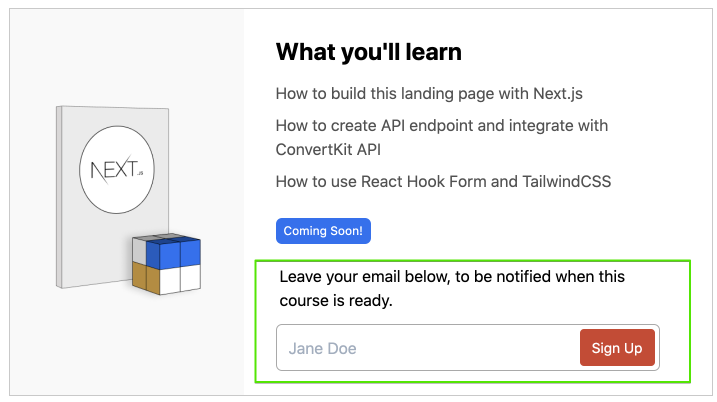
<SignupForm title="Leave your email below, to be notified when this course is ready." />
...
)
}
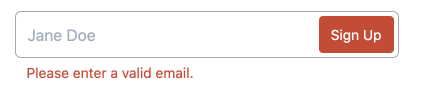
Invalid styles
To prepare for the from validation, we will also create ErrorMessage.
// src/components/SignupForm.js
const ErrorMessage = ({ message }) => (
  <p className="text-sm px-3 mt-1 text-red-500 inline-block">{message}</p>
);

const SignupForm = ({ title }) => {
  return (
    <>
      <form className="w-full max-w-sm">
        ...
        <ErrorMessage message="Please enter a valid email." />
      </form>
    </>
  );
};
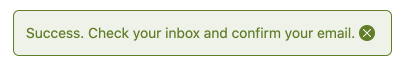
Success Message
When the signup is completed we want to show a success message, lets add a SuccessMessage component.
// src/components/SignupForm.js
const ErrorMessage = ({ message }) => (...);

const SuccessMessage = () => (
  <p className="text-sm p-3 bg-green-100 border rounded-md border-success text-success">
    Success. Check your inbox and confirm your email.
  </p>
);
Loading State
When the user submits the form we want to show "Processing" button instead of the default Sign Up text.
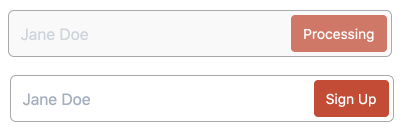
Before we implement the API we can simply hardcode the isLoading: true manually.
Based on the isLoading value we will update the classes on our elements.
classnames utility is a great helper for that.
// install classnames in terminal
npm install classnames

// src/components/SignupForm.js
import classNames from "classnames";

const SignupForm = ({ title }) => {

  const isLoading = true;

  // css classes for our UI
  const formClass = classNames({
    "flex items-center border rounded-md border-gray-300 p-1 focus-within:border-blue-500 focus-within:ring-blue-200 focus-within:ring-4": true,
    "bg-gray-100 border-gray-100": isLoading,
  });

  const inputClass = classNames({
    "appearance-none bg-transparent border-none w-full text-gray-700 mr-3 py-1 px-2 leading-tight focus:outline-none": true,
    "opacity-50 cursor-not-allowed": isLoading,
  });

  const btnClass = classNames({
    "flex-shrink-0 bg-red-500 hover:bg-red-600 border-red-500 hover:border-red-600 text-sm border-4 text-white py-1 px-2 rounded": true,
    "opacity-50 cursor-not-allowed": isLoading,
  });
  ...

};
Now we can simplify the return statement, use these new conditional CSS classes, disable button and input and show different text too.
// src/components/SignupForm.js
return (
  <>
    <p className="p-1 mb-2">{title}</p>
    <SuccessMessage />
    <form className="w-full max-w-sm">
      <div className={formClass}>
        <input
          className={inputClass}
          type="text"
          placeholder="Jane Doe"
          aria-label="Full name"
          disabled={isLoading}
        />
        <button className={btnClass} disabled={isLoading} type="submit">
          {isLoading ? "Processing" : "Sign Up"}
        </button>
      </div>
      <ErrorMessage message="Please enter a valid email." />
    </form>
  </>
);